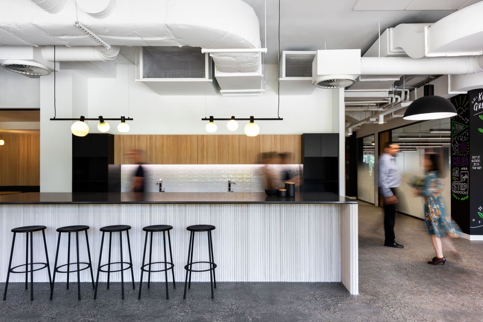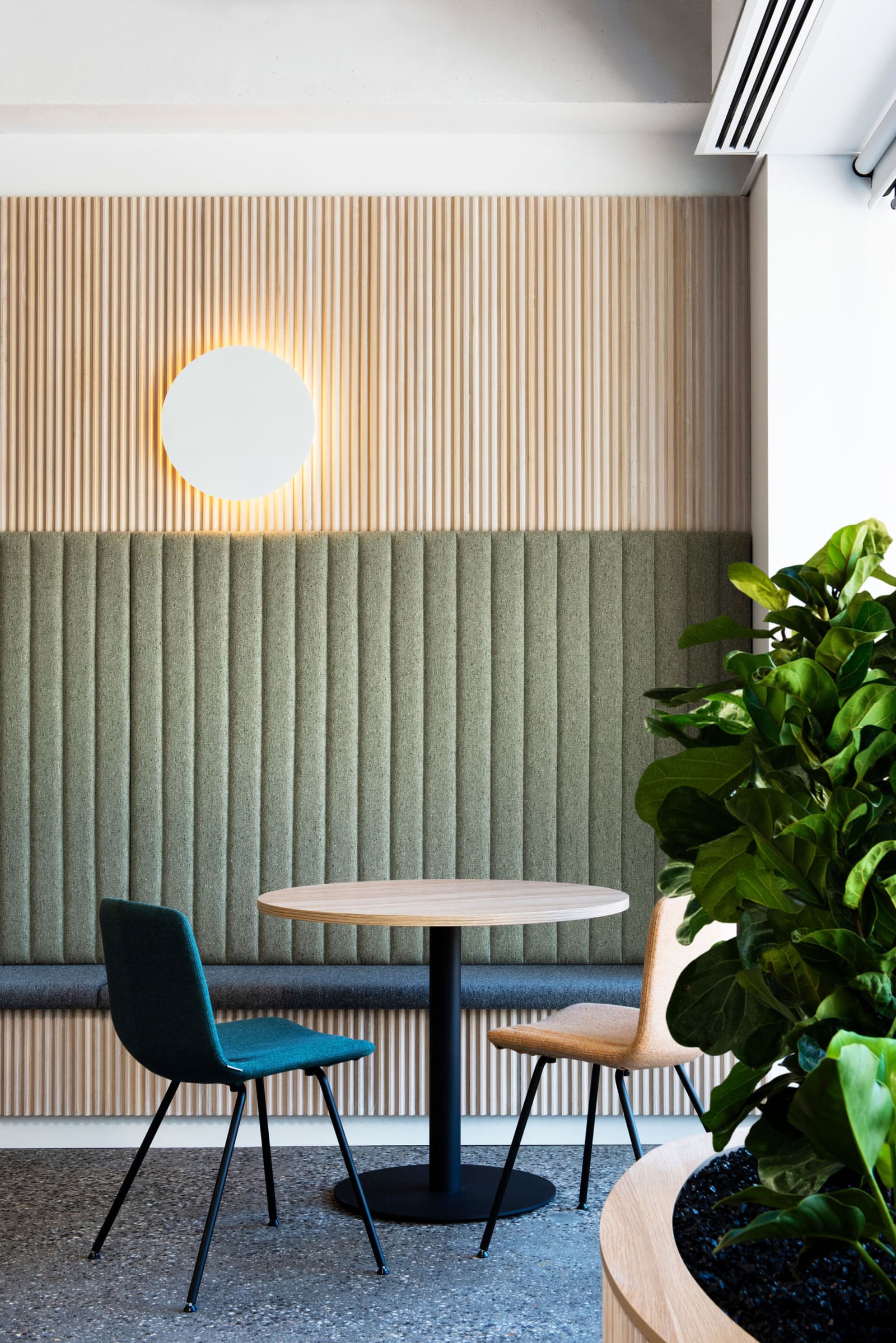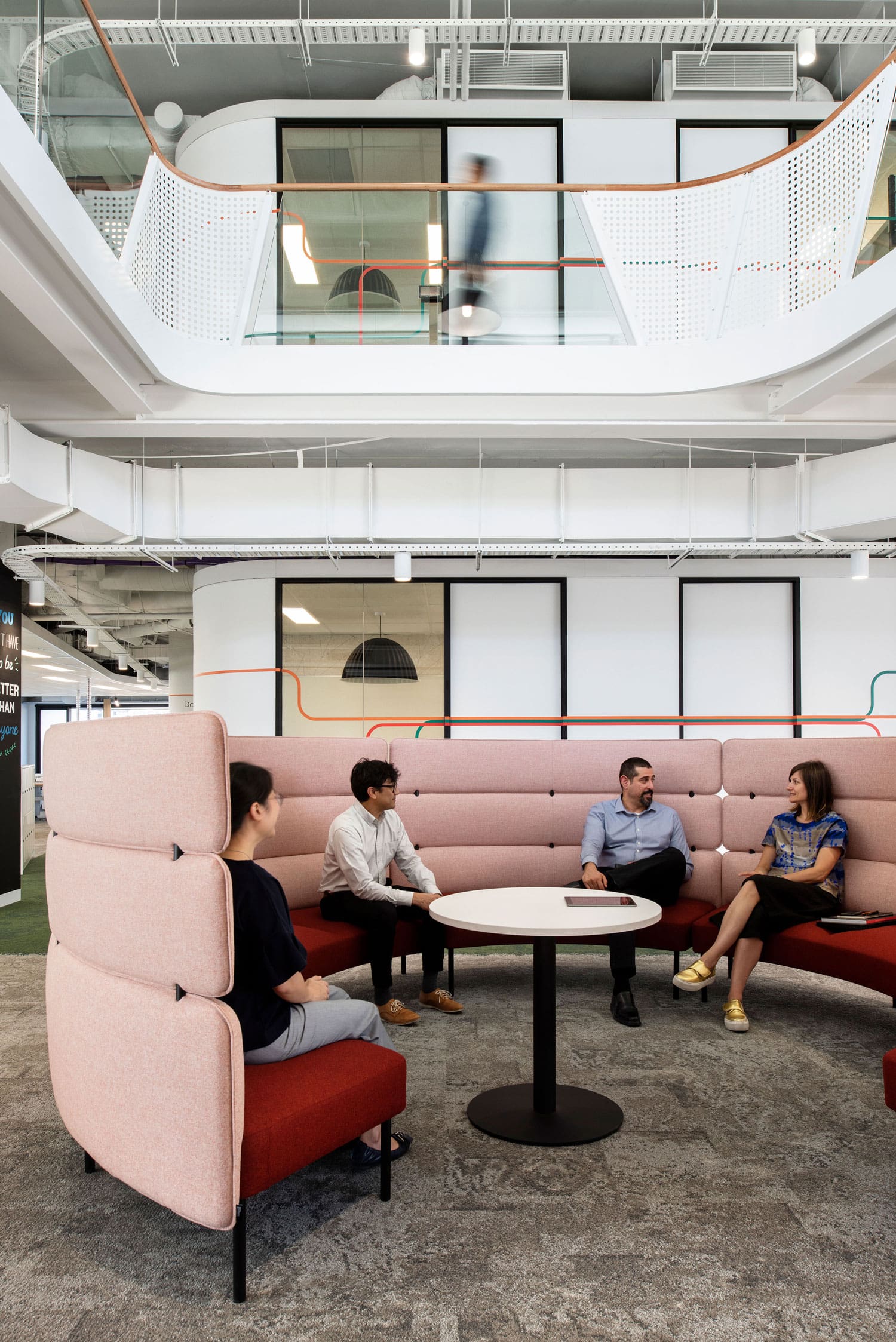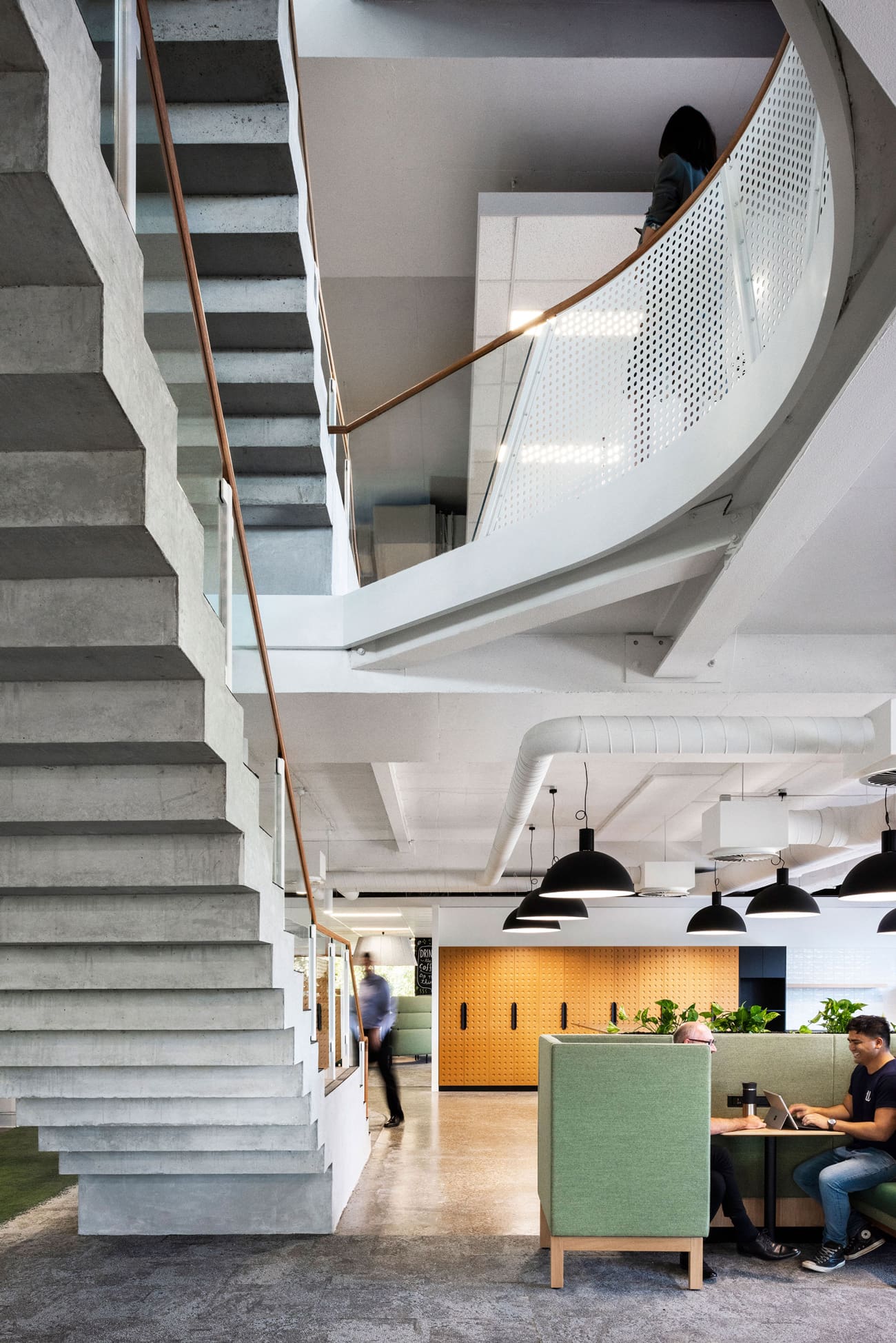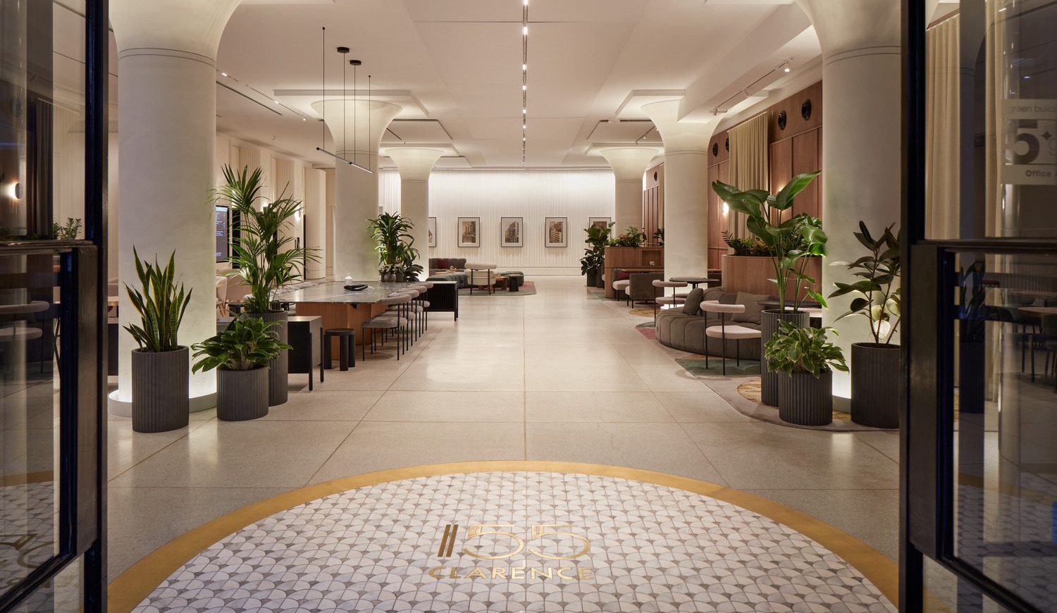
The concept of connection underpinned the design strategy.
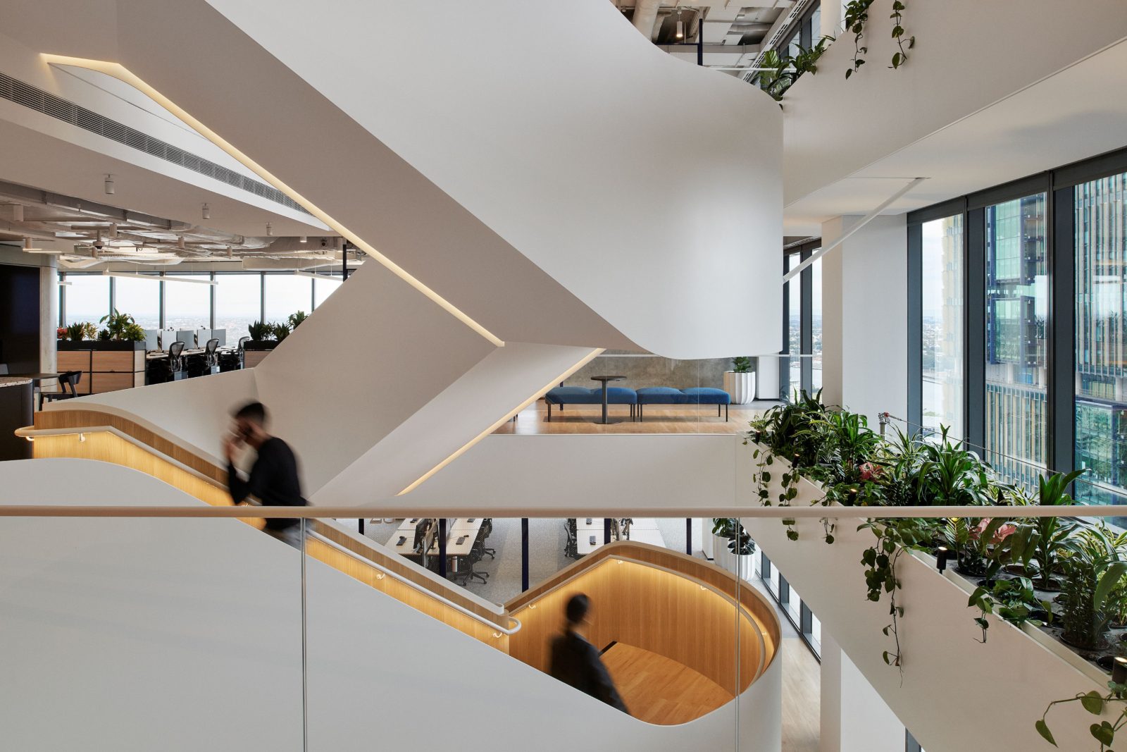
The expression and culture statement of making the ordinary extraordinary is realised in the volume of the space via voids.
Voids were punched into the floor plates connecting floors through sight and sound, while the existing stair was enlarged and refurbished to improve vertical connectivity.
Enabling innovation was a key driver, and a human-centred design approach was adopted. To support user choice and control, collaborative areas with adaptable furniture and mobile whiteboards were planned.
Plus, various simple-to-use, flexible workspaces, a test kitchen, a cafe, and a shop facilitate this theory on multiple zones across the floors.
An overlay of the brand story is present in 3D format via way-finding, value, culture, and mission statements. Artist-drawn columns create an imperfect personality within the space. These columns are chalk-drawn and have an intentionally short life span.
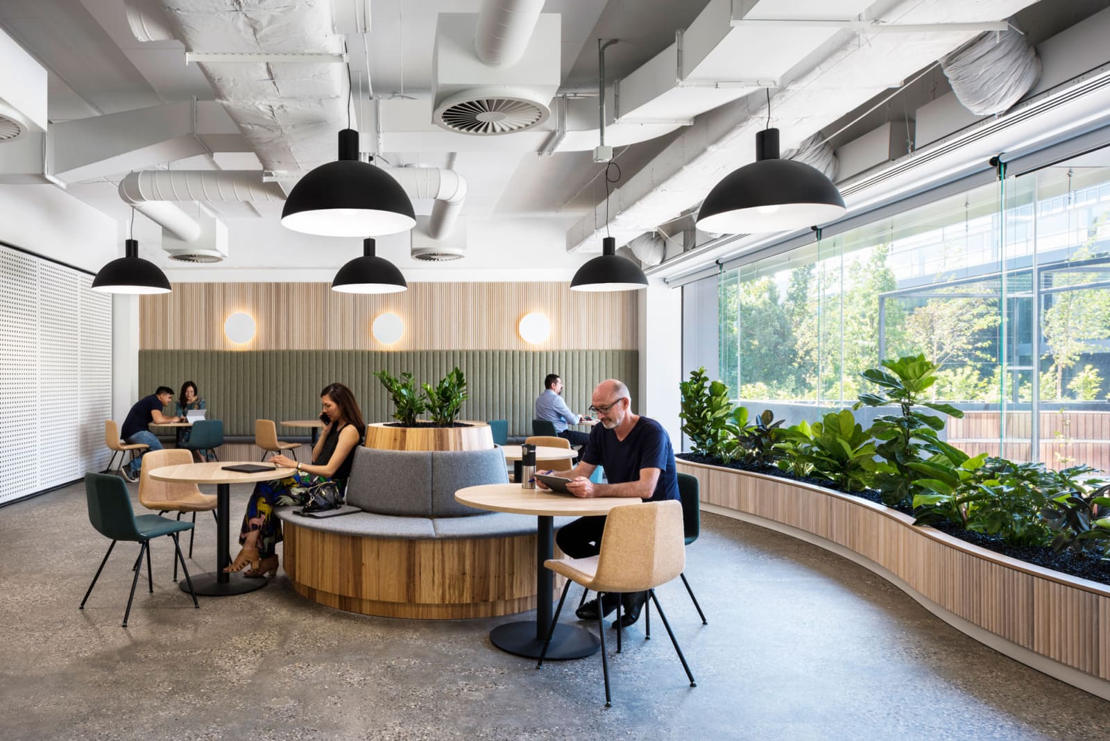
It was important to design for diversity, and the result is a snapshot of a small community with its variety of spaces supporting focus, collaboration (formal and informal), and individual and teamwork. The design goes further by including the other components of a community beyond the home, with the cafe and the shop.
